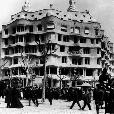
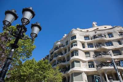
Casa Mila (La Pedrera) is regarded as Antoni Gaudi’s most iconic work of civic architecture due its constructional and functional innovations, as well as its ornamental and decorative solutions, which broke with the architectural styles of his day.
For Gaudi, La Pedrera represented the most advanced approach to a building on a chamfered street corner in the Eixample in Barcelona. It consists of two blocks of apartments, each with its own entrance, structured around two large interconnected courtyards with ramps down to the garage for vehicles.
FAÇADE
Curtain wall
The façade of La Pedrera is not a structural element: rather than serving the traditional function of load-bearing wall, it is instead a curtain wall. The blocks of stone (numbering more than 6,000) are connected to the structure by metal components, thereby making the large windows in the frontage possible.
There are three types of stone in the façade: limestone from the Garraf in the lower parts and in some of the structural elements; stone from Vilafranca del Penedès for the bulk of the façade; and limestone from Ulldecona for some of the features (the frames of some of the windows).
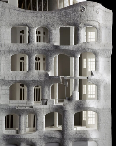 |
Model of the curtain wall, ©Fundació Catalunya La Pedrera. |
The wrought ironwork: the ingenious and sophisticated use of iron
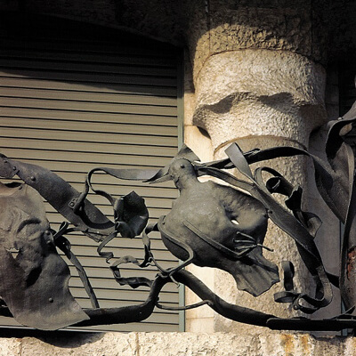
The complex and expressive wrought-iron grilles of the 32 balconies of La Pedrera were made using scrap iron sheets, bars and chains in an unusual but remarkably effective accumulation that complements the architecture and provides a decorative element. They are regarded as the forerunners of the abstract sculpture of the 20th century.
The photograph shows a detail of the first iron railing of what was the show apartment, flat 2n 2a on the second floor above the Milà’s main residence. Gaudi personally oversaw the making of this grille in the workshops of the Badia brothers in Barcelona. The various parts of the grilles are joined together by screws and rivets.
|
|
|
Detail of a hoopoe bird on the grille of the show apartment, ©Fundació Catalunya La Pedrera |
© Arxiu Fotogràfic de Barcelona. c. 1910 |
The wrought-ironwork: the entrance doors
Antoni Gaudi’s intention with these doors was to facilitate entry into the buildng and exit out to the street for both vehicles and people. Large sheets of glass were unavailable at the time, so Gaudi fitted together a series of panes in irregular shapes, based on animals and plants, creating an area of small, protected pieces of glass in the lower part (where they are at greater risk of being broken) and larger, more luminous pieces at the top.
This structure acts as a grille and as a door that can be opened in the middle to allow vehicles to pass through, and to the sides for people on foot.
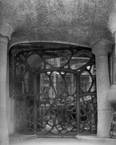 |
Photographer: Josep Maria Martino, c. 1914, ©Fundació Catalunya La Pedrera |
The wrought-ironwork: the grilles of the daylight-basements
The daylight basements of Casa Mila have large openings that were provided with iron grilles for protection. The grille shown in the photograph is believed to be Gaudi’s original design. For budgetary reasons, the other grilles were mass-produced to the same design, with vertical ribbons of metal adapted to fit the available space.
The 29 grilles of the daylight basements were gradually removed as the coal stores were converted into commercial premises. Nowadays, four of these grilles are held in two collections: one in the MoMA in New York, and the other three at the Gaudi House Museum.
At La Pedrera, two have survived at the Passeig de Gràcia entrance and there is a copy on the Carrer de Provença façade.
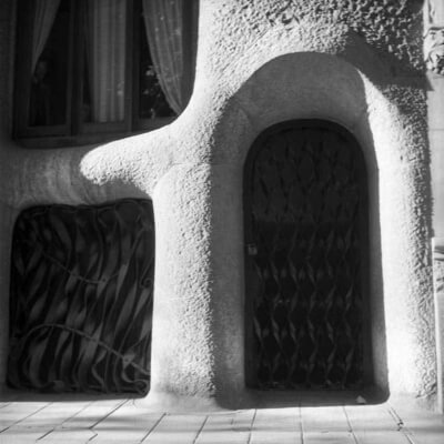 |
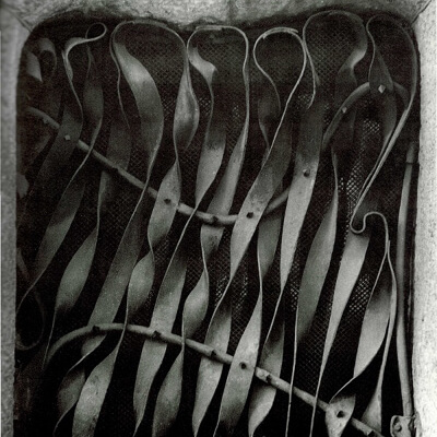 |
Grilles on the ground floor, 1946, ©Arxiu Nacional de Catalunya / Joaquim Gomis |
Grilles on the ground floor, 1946 ©Foto Aleu. |
BASEMENT
Gaudi anticipated the needs of modern life and in the basement of Casa Mila built a garage for coaches and cars, the first in a residential building.
He used slender iron columns, as well as an innovative metal structure reminiscent of a bicycle wheel, to support the floor of the courtyard above. The use of iron enabled him to reduce the built volume and to gain manoeuvring space.
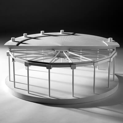 |
Model of the structure in the basement, ©Fundació Catalunya La Pedrera |
COURTYARDS
Gaudi introduced a major innovation into the type of buildings that had gone before. As well as small ventilation shafts, he built two large courtyards to improve the lighting and ventilation of all 16 apartments.
The wall paintings: entrance halls
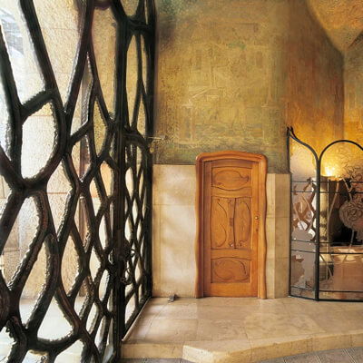
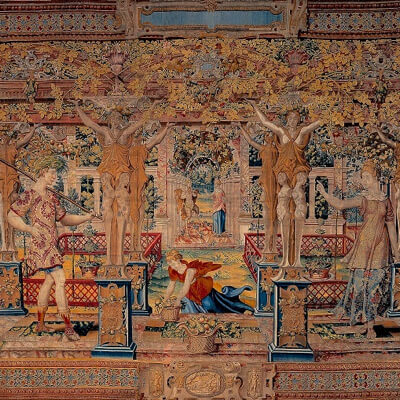
The Symbolist painter Aleix Clapés (1850 - 1920) was commissioned to oversee the pictorial decoration of Casa Mila (La Pedrera). The pictorial design for the entrance halls consisted of paintings that reproduced tapestries on mythological themes in the National Heritage Collection.
The tapestries reproduced in the Passeig de Gràcia entrance hall depict the love of Vertumnus, the god of seasons, and Pomona, the goddess of fruit trees and gardens (Ovid, book XIV of Metamorphoses).
 |
 |
Passeig de Gràcia entrance hall, ©Fundació Catalunya La Pedrera |
Tapestry of Vertumnus transformed into a harvester, 16th century, ©National Heritage Collection. |
In the Carrer de Provença entrance hall, a number of different tapestries are combined without clearly defined edges or borders in the same space. Greater freedom in the interpretation can be perceived in these works. On one side, we have the cardinal sins of wrath and gluttony; and on the other, the Heroes of the Trojan War and the Adventures of Telemachus series, both inspired by passages in the Iliad and the Odyssey.
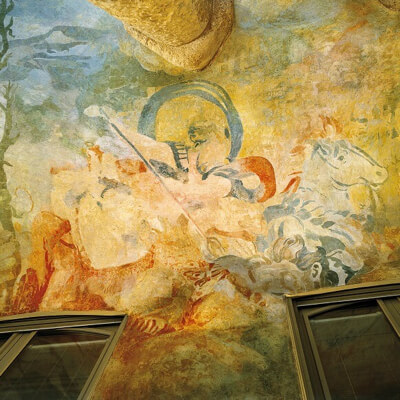 |
Carrer de Provença entrance hall, reproduction of the Tapestry of Wrath, ©Fundació Catalunya La Pedrera |
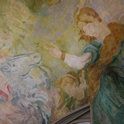
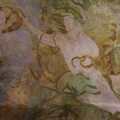
One notable difference between the original tapestries and these reproductions is the trompe- l'oeil on the adjacent wall and the ceiling of the staircase linking the Passeig de Gràcia entrance hall and the main floor.
This pictorial effect creates the illusion that we are going up or down a staircase floating alongside a garden and that this staircase is supported by columns on either side.
To achieve this illusion, Clapés painted columns in the likeness of the real columns situated at the other end of the steps.
 |
 |
Passeig de Gràcia main staircase, ©Fundació Catalunya La Pedrera |
Passeig de Gràcia main staircase, ©Fundació Catalunya La Pedrera |
APARTMENTS
Open plan
One of Gaudi’s most ingenious solutions is the structural system of pillars made of stone, brick or iron which, by eliminating the need for load-bearing walls, made it possible for him to freely distribute the interior space of the floors of apartments.
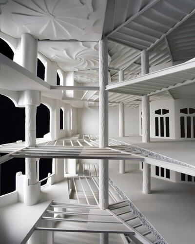 |
La Pedrera general plastel model: structure of stone and brick pillars ©Fundació Catalunya La Pedrera |
Distribution of a floor of apartments
The distribution of a typical floor is notable for its irregular geometry and its well-defined internal organisation, intended to make the most of the south-facing main façade.
People circulate within the building by using the well-lit, wide corridors around the courtyards. The lifts provide direct access to the entrance of the flats on each floor. Each floor is divided into four apartments in such a way that each one has a section of the main façade.
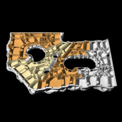 |
Floor distribution (four apartments per floor). ©Fundació Catalunya La Pedrera |
The ceilings
«In order for the ornamentation to be interesting, it must depict objects that bring to mind poetic ideas that constitute motifs. The motifs draw on history, legends, icons, fables concerning man and his life, actions and passion.» Antoni Gaudi.
The ceilings inside the apartments of Casa Mila are very varied: some are in high relief; others bear inscriptions and even poems. All of them are intended to continue the undulating rhythms of the façade.
Gaudi’s designs seem to wish to express the matter and forces of nature that have yielded to spontaneity. At the same time, they combine culture and tradition in the context of Modernisme.
The decorative motifs and shapes constitute a new plastic art never seen before despite the fact that it grew out of classical geometrical ornamental forms, from the simple circumference and its transformation into an ellipse to various spirals and volutes.
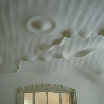 |
Detail of a ceiling in the mezzanine, ©Fundació Catalunya La Pedrera |
Roser Segimon never liked the décor, including the furnishings, that Gaudi designed for her apartment. When the architect died in 1926, she changed the entire decoration, opting for a more conventional style. This renovation resulted in the destruction of ceilings amounting to 532.50 square metres.
The rooms affected were the ballroom, the hall and the entrance hall—and their raised storage spaces—the office and drawing room, the dining room, the bedroom and the corridor. In addition, the parquet flooring and blinds were removed and 20 doors and windows were replaced.
The decorative arts
Gaudi employed the selfsame rigour and methodology to design both an entire building and a small object. He was always concerned with functionality, as he believed everything had to be of use to humankind.
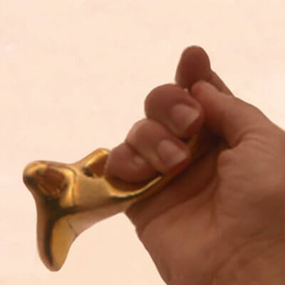
For the knobs and handles he used simple, anthropormophic shapes perfectly suited to the joints of the hand, making them easy to use.
 |
 |
Detail from the Design audio-visual presentation in the Espai Gaudí, ©Fundació Catalunya La Pedrera |
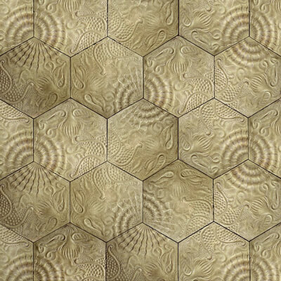
Hexagonal tile with relief motifs inspired by marine life: an octopus, a starfish and a conch shell. Hydraulic cement. ©Fundació Catalunya La Pedrera |
 |
 |
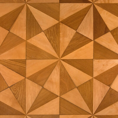
Parquet in the most important parts of the apartments: the dining and drawing rooms and the master bedrooms. Oak, maple and poplar. ©Fundació Catalunya La Pedrera |
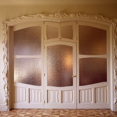
The door and window mouldings were treated as veritable works of sculpture. ©Fundació Catalunya La Pedrera |
The Pedrera Apartment
During a Essential La Pedrera tour, it is possible to view an apartment that reveals the building from a two-fold perspective: its architecture and its habitability. Situated on the fourth floor above the Milà’s residence, this apartment gives us insights into the way a bourgeois family in Barcelona lived in the early decades of the 20th century, recreating their home by using domestic furnishings and household utensils and equipment of the era.
The apartment also provides an opportunity to discover the interior distribution, as well as the decorative elements designed by Gaudi (knobs, handles, mouldings, doors, floorings, etc.). It is complemented by an audio-visual presentation that shows the rapid transformation and modernisation of the city in the opening quarter of the 20th century.
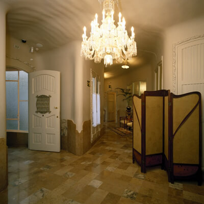 |
Entrance and corridor in the Pedrera Apartment. ©Fundació Catalunya La Pedrera |
THE ATTIC
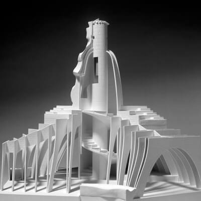
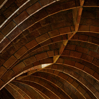
Gaudi constructed the attic on the floor slab of the top storey. To avoid adding to the weight of the building, he used 270 catenary arches made of brick to support the roof terrace. The catenary arch is light, easy to build, supports itself and needs no buttressing.
 |
 |
Model of the structure of the attic and stairwell, ©Fundació Catalunya La Pedrera |
Catenary arches in the attic, ©Fundació Catalunya La Pedrera |
Originally, the attic of Casa Mila housed the communal laundry area and acted as a vast insulating air chamber. Today, it is home to the Gaudi Exhibition, a unique display devoted to Gaudi’s life and work, particularly La Pedrera, presenting his creations by means of models and plans, objects and designs, photographs and videos.
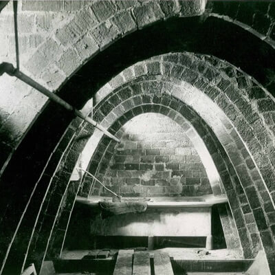 |
Laudry sink in the attic, ©Gaudí Chair-ETSAB-UPC. |
THE ROOF-TERRACE
«Buildings need to have a double roof, just like people have a hat and a parasol.» Antoni Gaudi
The roof of Casa Mila (La Pedrera) not only seals the building against the elements but also reveals three of Gaudi’s concerns: insulation, lighting and ventilation.
On the rooftop, we find order, beauty and tremendous functionality in the built features: stairwells, ventilation towers and chimneys.
Stairwells from the attic to the Rooftop
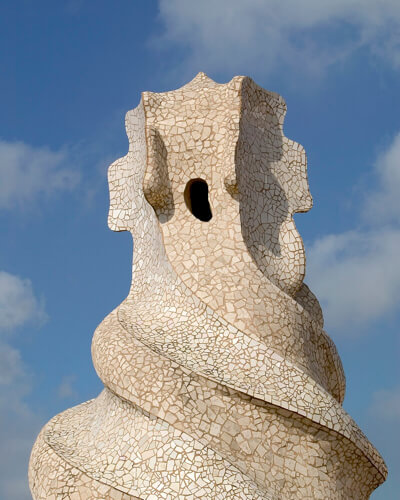
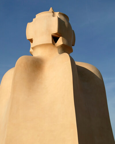
To soften the volumes of these constructions, Gaudi used curving forms, all of them derived from ruled geometry which, because of their concavity and convexity and conical shape, alleviate the effect of the built features.
Of the six stairwells, only four are covered with trencadís, in this case fragments of recycled and monochrome stone, marble or ceramic used to face the curving surfaces. The other two are rendered with lime and plaster.
 |
 |
©Fundació Catalunya La Pedrera |
©Fundació Catalunya La Pedrera |
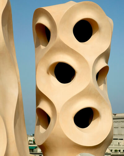
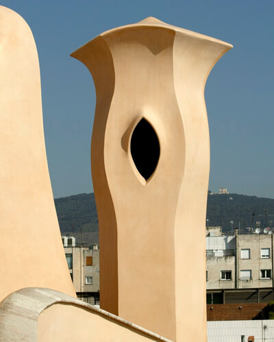
Ventilation towers that help to refresh the air in the attic.
 |
 |
©Fundació Catalunya La Pedrera |
©Fundació Catalunya La Pedrera |
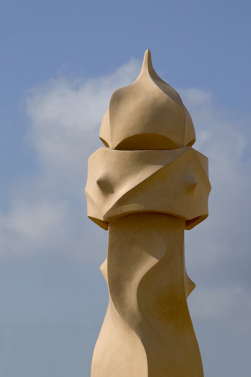
The chimneys
Some of the chimneys are individual freestanding constructions, while others are joined in groups of three or four. They rotate about their own axes, following an interior and exterior line that corresponds to the aerodynamic displacement of the smoke emerging from them.
 |
|
©Fundació Catalunya La Pedrera |
©Fundació Catalunya La Pedrera |


